John C. Mulligan

John's Coding Projects

About this page:

This page contains a few of my experiments with Python, Javascript, and HTML5. Below, I present the outputs of some of the programs I have written.

The projects are listed to the right, or you can just scroll down the page.

If you want to look at the source code for these projects, please visit my profile on GitHub.

Note: These projects showcase my ability to work with API's and object-oriented languages, but an example more apposite to my scholarly concentration is available on the Herschels page of my site.

Twitter Network Graphs:

Site Readers:

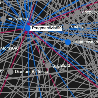
Brayton Point Coal Power Plant
Automatically-Generated, Interactive Network Graph

Background:
On May 15, 2013, two environmental activists piloted a lobster boat in front of the loading dock at Brayton Point power plant, in Somerset, MA. This action blockaded the plant against the delivery of a large shipment of Appalachian mountain top coal. The plant was the largest emitter in Massachusetts and is slated to close in 2017.

The two used the hashtag "#coalisstupid" to organize support on Twitter during the action. I used a Python script that I had written to capture all the tweets on that hashtag, and to map connections between the people tweeting. The result is a web of the Twitter activity and relations from that day from regional environmental activists. The program automatically downloaded tweets from roughly 200 different users, and established connections between them.

The below map looks messy at first, but is actually quite easy to use. You can:

  • Zoom in by scrolling, as you would on Google Earth
  • Click-and-drag in order to move around on the map
  • Move your mouse over to see the connections between different people
    (Red=inbound, Blue=outbound)

^ Back to Top ^

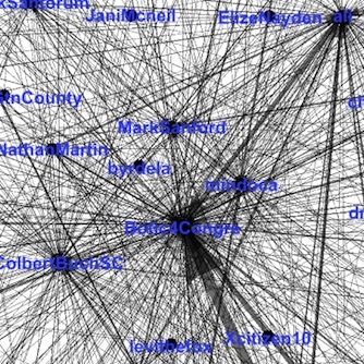
South Carolina Congressional District #1
Automatically-Generated Network Graph

Background:
In May, 2013, South Carolina held a special election in its first congressional district, pitting Mark Sanford against Elizabeth Colbert-Busch. The election was closely-watched by the news media, and political commentators of all stripes decided to say their piece on Twitter.

The dominant hashtag was "#SC01". On election night, I used my twitter hashtag-reading scripts to pull all the uses of #SC01 and to map the connections between the people who posted that hashtag. The result is a very dense network of top political bloggers and political figures, all congregating around the same issue.

The tweets were automatically downloaded and processed with my programs, and the below image was generated from this data set using Gephi.

Click to view the vector image (infinitely zoomable).

^ Back to Top ^

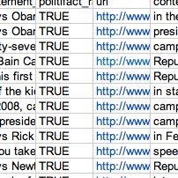
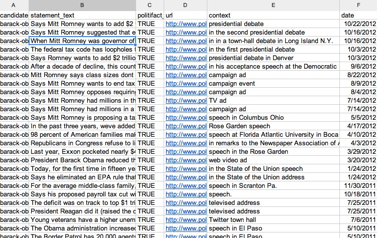
Politifact Reader
Organizes Truth-Ratings of Political Figures

Background:
Politifact is a fact-checking organization working under the Tampa Bay Times. The group rates the truthfulness of claims made by politicians, pundits, PAC's and news outlets. The site does not, however, allow one to compare, apples-to-apples, the relative truthfulness of different people.

Leaving aside the many critiques that have been made of Politifact's methods, they are one of the few sites that makes large-scale comparisons like this possible. I therefore wrote a script that, given the name(s) of politician(s), would quickly read through the relevant articles and output spreadsheets with statements categorized and dated, and linking back to the original entry. Below, I show a screenshot of the spreadsheet for Barack Obama.

Click to view the public drive containing the rated statements of several politicians.

^ Back to Top ^

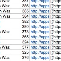
Washington Post Reader
Organizes Data from Drone Strike "App"

Background:
In October 2012, the Washington Post launched an interactive map cataloguing American strikes from the unmanned arial vehicles commonly called "drones." Their application draws on a number of different news stories to determine when and where strikes take place, and additional information on these.

Their app caught my attention because this is a highly controversial military program, whose secrecy leads to different counting methods by different groups and therefore disagreements over the basic facts surrounding the issue. Indeed, WaPo's counting methods, which graph only strikes and not deaths caused the leading authority on the issue, the UK Bureau of Investigative Journalism, to abandon plans for working with the newspaper on this project.

I therefore decided it would be useful to be able to pull the Washington Post's counts and its list of sources for this project, in order to be able to compare these systematically with other organizations'. The script I wrote simply reads their front page for this information and outputs a spreadsheet with the relevant data.

Below is embedded the spreadsheet of results, updated in January 2013.

^ Back to Top ^